I’ve done a few paintings in the last weeks that I’ve yet to post on this blog, so here they are. These were painted on site around San Diego County, mostly with the San Diego Plein Air Painters group , of which I’m a member. I’m also a member of the Laguna Plein Air Painters Association — LAPAPA, as well as the Southern California Plein Air Painters Association –SOCALPAPA and the San Diego Museum of Art Artist’s Guild — SDMAAG.
Batiquitos Looking West ~ 11 x 14 in. plein air oil painting by artist Ronald Lee OliverBatiquitos ~ 12 x 12 in. plein air painting by artist Ronald Lee OliverOsprey Rock ~ 11 x 14 in. plein air painting by Ronald Lee OliverCoronado Anchorage ~ 11 x 14 in. Plein air painting by Ronald Lee Oliver
February 14th, 2015 in Southern California. The air temps got up to over 90 degrees in the inland areas. I headed West, early this morning to paint at the area in Point Loma known as “Sunset Cliffs.” It was already warm and not the least bit cold as I painted at the top of a cliff, near waters edge above the surf below…here’s a short video of the beautiful conditions and the painting I made. 11 x 14 inch oil on panel.
…and here’s an example of how it would look in a nice “New Rustic” solid wood frame by Randy Higbee galleries…
This is my “go to” frame to compliment my plein air paintings…
There is a phenomenon known as “the artist’s curse”–a state of perception in an artist of their own work as inferior and somehow lacking. It is a virus of self-doubt instilled by the ever-present voice of the inner critic who notes with a jaundiced and magnifying eye only the flaws, imperfections and shortcomings in the execution of a piece of work. The inner critic measures the latest attempt against past successes, other artists master works, or impossibly high aspirations. It can lead an artist to destroy perfectly wonderful pieces of their labor in a pique of self loathing and doubt. I think it must be something like the pathological state of postpartum depression in a mother who has delivered a child.
To combat this disease I believe it’s always best, as an artist, when completing a fresh work to pause, wait a while and put the voice of the inner critic on “mute.” To let a painting “rest” for a time. To avoid the temptation of tweaking and making “little fixes” here and there. To avoid the nagging thought that, “if only I do this…or that…to this painting, it will be better.” The state of final “finish” is arbitrary and elusive for each work and it is in this hyper-critical state of emotional attachment as we near the culmination of a painting that we can succumb to excessively analytical and even pathologically delusional perceptions of our own work. It is the time when we most risk the fault of “over working” our piece. Many a fine painting is ruined in the finish–most often by acting upon the infected perception of the inner critic. Ironically, it is this sycophantic voice that prods us to “fix” which leads us to ruin and thereby causes us to hate and even destroy the works that somehow do not live up to our expectation.
It’s better to put the brush down and leave a canvas in a semi-finished state that conveys some truth, than to fastidiously pick at little details until the spontaneity, mystery and truth have been thoroughly abused. By allowing the mind time to rest and detach from the passion of the moment–by muting the inner critic, we may return to comprehend with fresh, unprejudiced eyes, the beauty we’ve been fortunate enough to transmit and share with the world.
I plein air painted at Ramona Grasslands with the new portable palette I recently crafted in my workshop. It was the “maiden voyage” for the palette, which I based on the Jim Coulter palette system–a clamshell design with an adjustable mast to hold various sizes of panels or canvas. If you’re not DIY inclined, you can see (and buy) Jim’s version of this plein air painting system, here…
I chose to make my own, larger than any available from Jim because I like lots of space to mix and lay out my tools of the trade. It worked out well and even though a large palette, it was not difficult to hike in the half mile with everything I needed to paint.
Chromatic single pigments and earth colors.
The colors seen on the palette, laid on a piece of grey masking tape for friction (to keep them from sliding around) and ease of cleanup, from left to right, are:
cremnitz white
unbleached titanium
Primary magenta — R
cadmium red light — O
Primary yellow — Y
phthalo green-yellow — G
Primary cyan –B
ultramarine deep — I
dioxizine purple –V
yellow ochre
transparent red oxide
Payne’s grey
Mars black
…I also used a bit of “asphaltum.”
The panel was toned in advance with transparent orange.
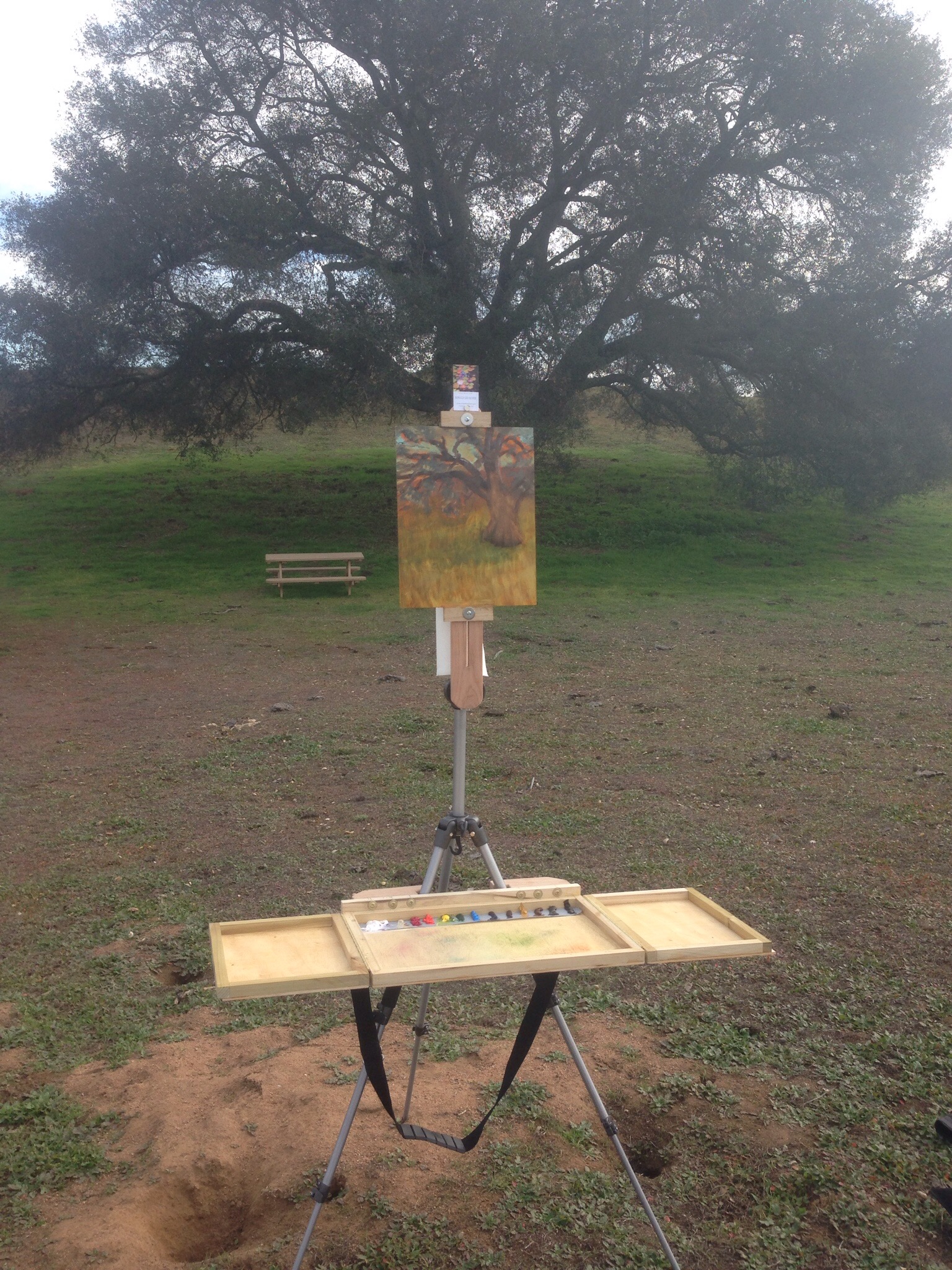
Following are some photos of the easel, “in the wild,” where I bravely set my tripod over the opening to a den of vicious and possibly rabid squirrels. You can see the bucket I use to carry all the necessities, too. Those long, black nylon bags hold the tripod and my umbrella kit (which I didn’t need but brought along just in case). They both have shoulder slings, as does the palette box,which make all three quite easy to portage to the painting site.
RLO portable palette at Ramona Grasslands.
I chose to paint a view of the largest oak tree in the grasslands. You can get an idea of the massive size of this old oak, compared to the heavy-duty, park picnic table nearby. You can also see here the beginning phase of the painting where I’m establishing the shape of the tree.
Beginning block in of plein air subject.
…and finally, in this next photo you can see where I chose to stop painting. I was having a difficult time resolving this one. As I say to myself, “you can’t win them all,” and this one was giving me fits so I decided to pack it in and call it a day. I’ll take time to let it rest and then return to it in the studio to see if I can make better sense of it. I didn’t scrape it off entirely, which I would do if it was a total failure, so I think there is still a painting here, waiting to be finished, signed and framed.
Sometimes it’s best to stop and reflect…
Here’s a skewed (to avoid glare) iPhone pic of the painting…
An example of a stopping point in a plein air painting work in progress.
Here’s an update after some studio work on this painting…
I was surprised and pleased when an agent from Dick Blick informed me they wanted to feature an image of my painting, “The Watering Hole” in their Winter 2015 print and multimedia flyer.
Of course I agreed and also put in a plug for their “Masterstroke” brushes, which really are good quality sable brushes for the price. I think it’s a fair deal–I get the benefit of some free (relatively) publicity and they get to feature a wonderful work of art to promote the sales of their brushes.
Above is an image of the ad as it ran in the flyer, along with the “Plug” from yours, truly. 🙂
If you’d like to see a time lapse video of me painting “The Watering Hole,” you can click on the play button below, which will play the video directly from my YouTube channel.
Mele Kalikimaka is the thing to say On a bright Hawaiian Christmas Day That’s the island greeting that we send to you From the land where palm trees sway…
I guess after all I was not so naughty this year that I wasn’t able to make a Christmastime excursion with my beautiful wife, Jackie, to the Hawaiian Island of Maui.
This wasn’t a “painting only” trip, so I only made time for two 11 x 14 in. panels but they were both lots of fun to paint. Even though the Trade Winds were fierce during one of the painting sessions, I managed to finish with no mishaps.
Though probably not the wisest thing to do, I diverged from my usual painting methods on this air travel trip and was winging it (no pun intended) with a color palette and paints I had never used before. To lighten the load and simplify things for flying, I chose to go with a five color palette and used water mixable oil paints for the first time.
It was really surprising how well it all worked out!
Flake White Replacement (non-toxic and creamy consistency)
Each morning of painting, I pre-mixed a very vibrant chromatic palette from the three water mixable “primaries” which produced some very convincing greens, oranges, and fuchsias, as well as deeper purples. I was careful not to “overmix” the paint piles, leaving striations of broken color in the mixes. A sealable “Guerilla Painter” 9 x 12 in. palette tray kept the paint fresh and protected inside my pochade while exploring for a suitable view to paint.
This color palette worked very well and much to my relief, there was no problem mixing the “oil” paints with the water miscible paints. The Cobra paints especially were surprisingly “creamy” in consistency and were very easy to mix and move about on the panel. While painting, when I felt I needed a little more “flow,” I used a mixture of my standard recipe medium, transported in an eye dropper bottle that consisted of equal parts stand oil, turpentine, and dammar varnish. I brought no solvents because they must not be flown over (TSA will confiscate) and it is an extra trip to the hardware store to get some when you arrive and then there’s nowhere to conscientiously dispose of it when you leave.
Another interesting thing about creating these two paintings is that I used one single brush the entire time! I brought my brush wallet but became so engrossed in the painting process and not wanting to waste any time in capturing the light that I worked only with a single, quarter-inch “bright” hog bristle brush. I held a paper towel sheet in my left hand and wiped the brush clean between different colored passages. I was able to make a surprising variety of marks with the stiff but springy little bristle bright. The only other implements I used to apply or mark the paint were my finger and in some few instances I removed paint with a cotton swab, which are essentials that I always pack when I paint en plein air.
All said and done, I had a great time in Hawaii and having the opportunity to paint made the trip just that much more special.
I’d like to say to any reader who chanced here and happened to read this far…
Here we know that Christmas Will be green and bright The sun to shine by day And all the stars at night Mele Kalikimaka is Hawaii’s way To say Merry Christmas to you!
Varnishing a finished painting is a vanishing art.
Many if not most contemporary artists don’t bother, preferring to sell their paintings with a matte finish. Some don’t like to wait for the paint to dry before the application of varnish, especially since the historical recommendation is to wait six months to a year beforehand. I varnish my paintings 3 to 4 weeks after they are dry to touch. At that time the paint surface has oxidized and polymerization of the paint has stabilized (there are many studies on this, which I’ve read). Molecular cross-linking, a form of drying will continue internally, under the paint film and then under varnish, for decades. I don’t paint with ridiculously thick and deep impasto layers and I also use a medium, mixed with my paints to accelerate the drying oxidation/polymerization process, so I’m not concerned with areas of my paintings cracking or needing a prolonged drying period before varnishing.
I use a traditional dammar varnish–using the same recipe artists have used for centuries–which I make myself with easily obtained ingredients–dammar crystals and turpentine. Dammar crystals are the hardened sap which is gathered from dammar trees in the tropical forests of India and the South-East Asian peninsula and archipelagos. Here’s a Wikipedia link:
It’s gathered in much the same way Maple syrup farmers tap the trunks of Maple trees to gather the sap, only dammar crystals harden on their own and do not need to be cooked down after harvest.
Dammar crystals, when burned also make a heavenly incense and if you’ve ever been in a Roman Catholic church on a Holiday or Feast day, you’ve probably smelled the scent of burning dammar crystals (it’s often a blend of dammar with frankincense and myrrh, or a host of other aromatics). If you get your nose close to the surface of one of my paintings, you can actually get a sense of this fragrance.
To make the varnish, the dammar crystals must be dissolved in a solution of pure gum turpentine (about 2 to 1 turp to crystals), which is in essence the sap of pine trees which has been distilled down to the volatile aromatics and terpenes. I usually make a batch of varnish in an empty, glass pint-sized jar with a tight, screw-on lid. It takes a few days of occasionally shaking the jar vigorously until all of the crystals are dissolved in suspension. Then, the solution can sit for a day or two until any unwanted particles of bark, dirt or dust settle to the bottom of the jar. Decanting of the pure varnish is then done to another clean, glass jar, leaving the residue behind.
Diamond G Forest Products makes an Excellent Artist’s Grade Turpentine…
That’s it! These two ingredients, both derived from tree sap, together make an excellent, clear varnish which will not only protect the surface of the paint from damage and pollutants such as dust and smoke but is easy to clean and even remove if necessary.
Dammar varnish will yellow slightly, over time (decades) but this can actually give a painting a warm and subtle tone that can in some instances (especially landscapes) enhance the atomosperic aura of the painting. If ever the painting needs re-varnishing, the old varnish is removed with turpentine alone and another fresh coat of dammar varnish is applied. This should be done by a professional conservator or at least with great care not to remove the paint layer below the coat of varnish, because turpentine will dissolve the paint, even if it has been dry for centuries! Cleaning the surface of a varnished painting can be done with a mild solution of Castile soap and distilled water, using a soft cloth and a gentle touch.
Protecting the paint surface and making it easier to clean aren’t the only benefits of dammar varnish–It also enhances the depth of colors and accentuates the contrast between the light and dark tones in the painting. It provides a translucence, a luster and depth that is the completing step that really makes a painting come to life.
I think finishing a painting with dammar varnish is the right thing to do and shows the artist cares enough about his work that he wants to enhance, protect and preserve it for future generations.
I painted en plein air recently in a place that has always intrigued me with it’s dramatic architecture, interesting shadows and reflections and of course the famous red trolleys–that is, at the San Diego Metropolitan Transit system’s Santa Fe Depot at One America Plaza in downtown San Diego. Here’s a pic of the architecture which previously won an “Orchid Award” in the annual San Diego Architectural Foundation review of San Diego developments and construction projects which either effuse the elegance of an orchid…or the stink of an onion.
The arch of the Trolley weather port at Santa Fe Depot.
I arrived early…before 8:00am and set up my easel in the traffic island at the center of the intersection at Broadway and Kettner. It was a great place from which to paint and provided the perfect vantage of the trolleys coming and going. Painting the trolley itself was done in fits and spurts as one trolley would leave but another would arrive in minutes and for the most part, with a few exceptions, was identical. Here’s a pic of my easel, with two trolleys in the station in the background…
Easel and painting of Ronald Lee Oliver
It was interesting to paint with the traffic rolling by and when the traffic would stop, folks would gawk out the car windows, inquisitively at the patently unusual sight of a crazed plein air painter in the middle of traffic, wearing a big, Guatemalan palm leaf, cowboy hat, pacing to and fro, wielding a long, paint laden brush like a picador, stabbing at a canvas as if it were a snorting bull trying to gore him. Many pedestrians walking by gave the big, “thumbs up” and commented that I was making a beautiful painting, which is always encouraging. Here’s the result of the morning’s effort–a 16 x 16 inch oil on stretched canvas, titled “Rolling Through.” Whether it is an “orchid” or an “onion” or the bull won is in the proverbial eye of the beholder…
Santa Fe Trolley Depot as painted by California artist, Ronald Lee Oliver
Like the ocean? Like Hawaii? Like flowers? Why not combine all three in a series of Hawaiian Floral Seascape paintings!? I’ve been working on just this feat, recently and really enjoying the process. It allows for the play of some bold, complimentary colors and the challenge of arranging a pleasing composition. Here is a composite of four, recently completed panels (12×12 in. oil on deep cradled birch). I haven’t run out of flowers that are suitable for this series, yet, so there may be few more forthcoming!
Hawaiian Floral Seascapes ~ Original Oil Paintings by Ronald Lee Oliver
Lae O Na Kohola (Cape of Whales) 24 x 24 in. oil on canvas
On the Northwest side of the Hawaiian island of Kaho`olawe is Ahupu Bay, whose Western point is called Lae O Na Kohola, or Cape of Whales. There, the great leviathans return in yearly consort to make connections with one another. To win paternity. To begin Maternity. To give birth and protect the newborn. To establish lineage and once again venture Northward to the yearly feeding grounds, where they will fatten to return again and renew the cycle.
Here, I’ve depicted one of the majestic Kohola, or humpback whales, breaching in the fiery dawn of a typical Hawaiian sunrise. Here is a detail section from the larger painting:
Detail from Lae O Na Kohola (Cape of Whales) by Ronald Lee Oliver
This painting was achieved in one session, or “alla prima,” an artsy Italianate term for “at once.” It requires that the artist have a good idea of where they are going before they first lay brush to canvas. I toned the canvas with a mixture of transparent orange and burnt sienna the night before, which allowed it to dry and act as an underlying accent color. The overnight drying time ensured it would not smear and mix with the strokes of color placed on top. Most of the colors in the upper layer are transparent oil paints, as opposed to opaque tints, which allows for a certain depth and serendipitous atmosphere that can’t be achieved with the opaque pigments.
This painting is 24 x 24 inches and is framed in a complimentary black frame with matte and glossy accents.
Pua Akala (Pink Hibiscus) 12 x 12 in. oil on deep cradled panel by Ronald Lee Oliver
Another in my series of Hawaiian Floral Seascapes. Seen just about everywhere in Hawaii but like a younger daughter, the Pink Hibiscus must always be subordinate to the elder, yellow hibiscus which is the State Flower of the Islands …she is just as delicate and beautiful though.
This is in the same format as some of my other Hawaiian floral oil paintings, which are all in the 12 inch square format on 1.5 inch deep, hardwood cradled, birch panels, suitable for hanging with or without a frame. This colorful series of paintings brightens any space with a vibrant, tropical splash.
Pua Melia (Plumeria) 12×12 in. Oil on deep cradled panel
Blue Hawaii and white coral sands form a backdrop for the close-up of this fragrant sprig of plumeria blossoms. The plumeria flower is one of the most recognizable flowers of the Hawaiian Islands. They come in a variety of colors from creamy white to vibrant yellow and a deep, luscious red. If you ever visit Hawaii, bring some freshly cut plumeria or a fresh plumeria lei to your room for the most amazing and relaxing room freshener that will last for days to calm you and make you breath deeply of the intoxicating scent.
The yellow hibiscus is the State Flower of Hawaii. Some of the specimens that can be seen there are Amazing! I like to say, in a voice reminiscent of the young Forrest’s Doctor in the movie, Forrest Gump,
“They’re large as dinner plates!”
This painting captures the bold, lush petals of a giant “Pua Aloalo” against a backdrop of Blue Hawaii.
Pua Aloalo (Yellow Hibiscus) 12″ x 12″ oil on 1.5″ cradled panel
Just about any beach in Hawaii is beautiful but some are absolutely heavenly. On the South West side of Maui, there are some little sandy coves between the fingers of lava that provide views of the islands across the channel.
Kahakai Lani (Heavenly Beach) 24″ x 24″ oil on gallery wrapped canvas.
Kahakai Lani (Heavenly Beach) 24″ x 24″ oil on canvas
As I’ve said before, Hawaii is one of my favorite places to photograph and paint. This could be a beach just about anywhere in the Hawaiian Islands. I call it “Gift of the Sea” or in the Hawaiian tongue, Makana Kai.
Makana Kai (Gift of the Sea) 24 x 24 in. oil on gallery wrap canvas
I took the camera and telephoto lens out today and made a visual diary of my stroll along “La Jolla Coast Walk,” which is a short but scenic trail along the top of the cliffs above the La Jolla Caves. It was overcast, which is typical of La Jolla, early in the morning. The sun doesn’t come out there until about 11:00 am, or later, if at all. I was able to get some interesting shots, even in the diffuse light. They’re there if you have the patience to look for them.
Enjoy.
Hint: Click on the first image, upper left, then use the navigation arrow in the viewer box to click through the slide show.
A plein air QuickDraw is an outdoor event where a group of painters, usually invited to the event by a jury selection process, all compete to produce the best painting (as opined by the event judge) in a limited amount of time…typically about two to three hours.
The above painting, Serendipity, was completed in two-and-a-half hours at the April 12, 2014 San Diego Botanic Gardens QuickDraw, which had 16 painters participating. Not all of the time was spent painting…much of it was spent talking with interested onlookers and patrons of the botanic gardens. There were three ribbons awarded, which included some cash prizes. No ribbon for Serendipity–but hey–what does a judge know about what is the best, eh? 😉
The important thing is to get a good result and judging by response from patrons and other artists at the event, this one was well received. I am honored that Serendipity was selected by jury for exhibition in the June 2014 Regional Artists Show at the Museum of the Living Artist at the San Diego Art Institute in the Prado at Balboa Park.
Fort Rosecrans National Cemetery 18 x 18″ oil on canvas
I got out early with my plein air kit and drove…no particular destination in mind but felt the water pulling me to the West. It had been a few weeks since I’ve painted the environs of our Southern California coast and it is always a source of excellent subjects for rendering with a brush and paint.
I found myself heading up the Point Loma Peninsula via Rosecrans Boulevard. Once inside the Navy Base and Federal Reserve lands up there I was amazed, as always, at the sense of height and distance from that perspective. Downtown San Diego and Coronado are seeming miniature villages, miles away and below as you drive through the hallowed grounds of the National Cemetery. It is a somber, yet peaceful and beautiful place. I recommend that any visitor make the drive, but definitely stop and get out of your vehicle. It is worth the effort to take some time to feel the fresh sea breezes, hear the peaceful quiet and take a few moments to reflect on the fallen soldiers and military who rest in peace there.